Now Reading: Kyoto’s one metre coffee stand turns patinated copper into a city signal
-
01
Kyoto’s one metre coffee stand turns patinated copper into a city signal
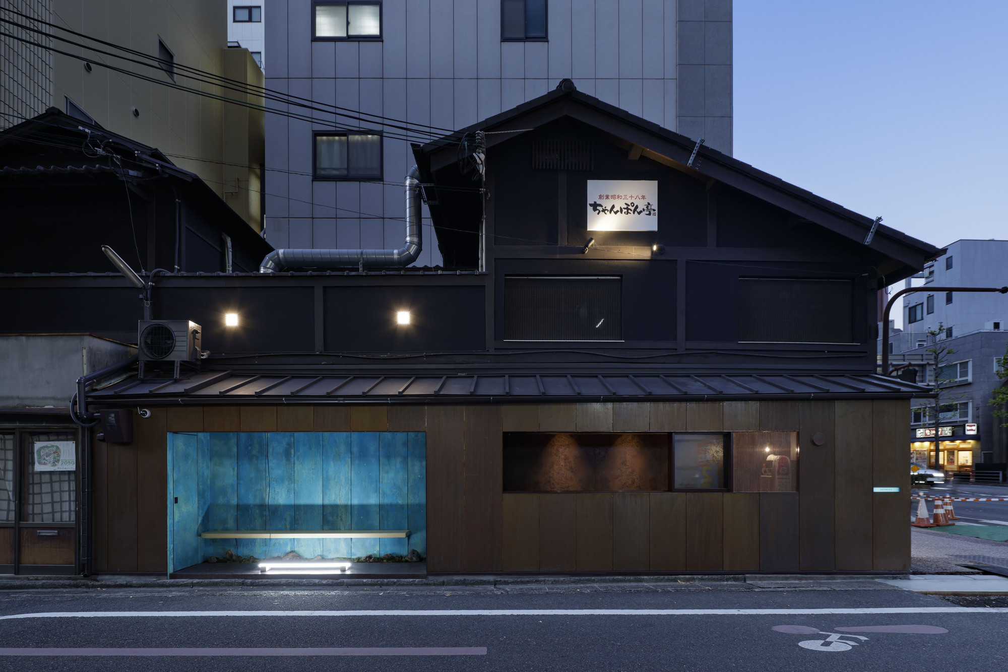
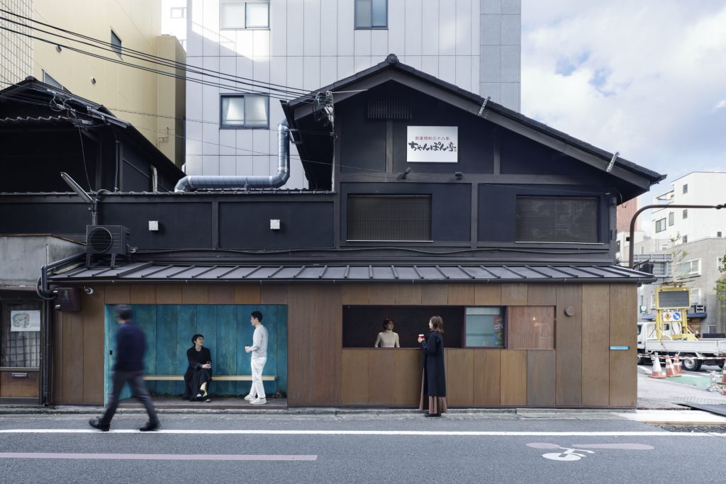
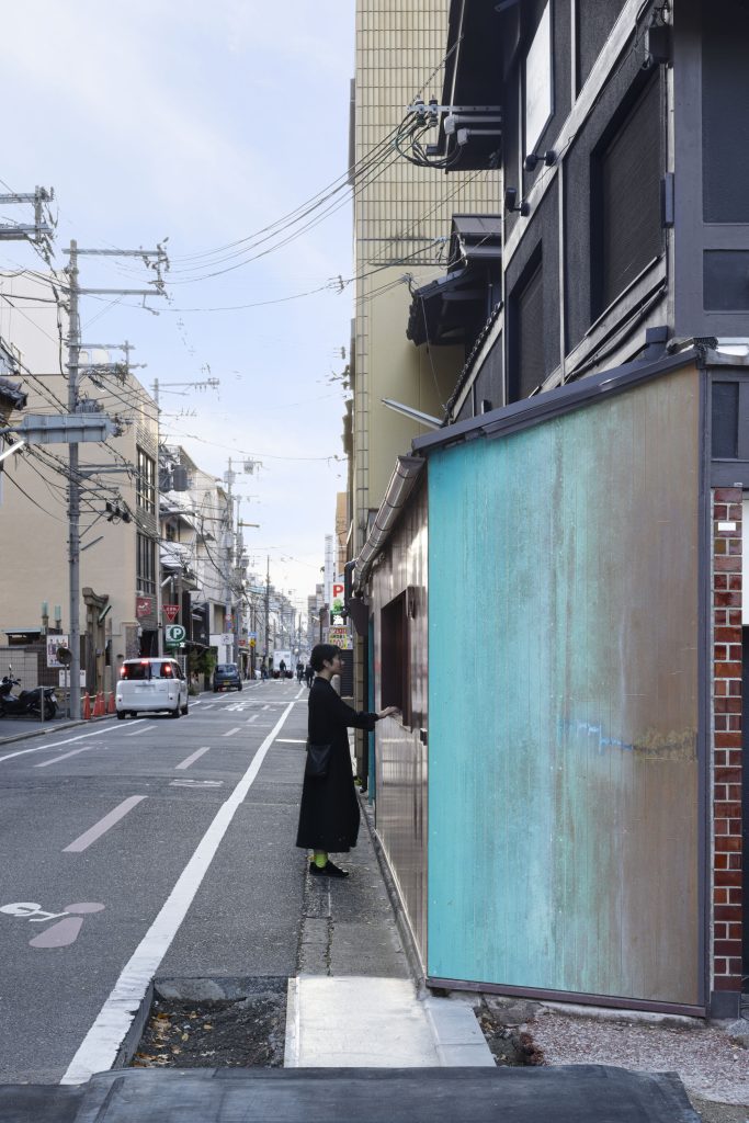
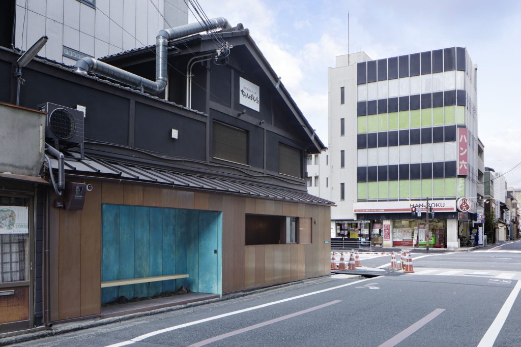
Wedged into an urban seam between hotels and office buildings, the Suetomi AOQ Cafe Stand occupies a footprint that is almost implausibly shallow. With barely a metre of depth to work with, the project does not attempt to compete with the surrounding intersection. Instead, it settles into it quietly, offering coffee from a space that reads as both infrastructural and ceremonial: a compact pause in the city that also operates as a contemporary sign for Suetomi’s long-standing confectionery culture in Kyoto.
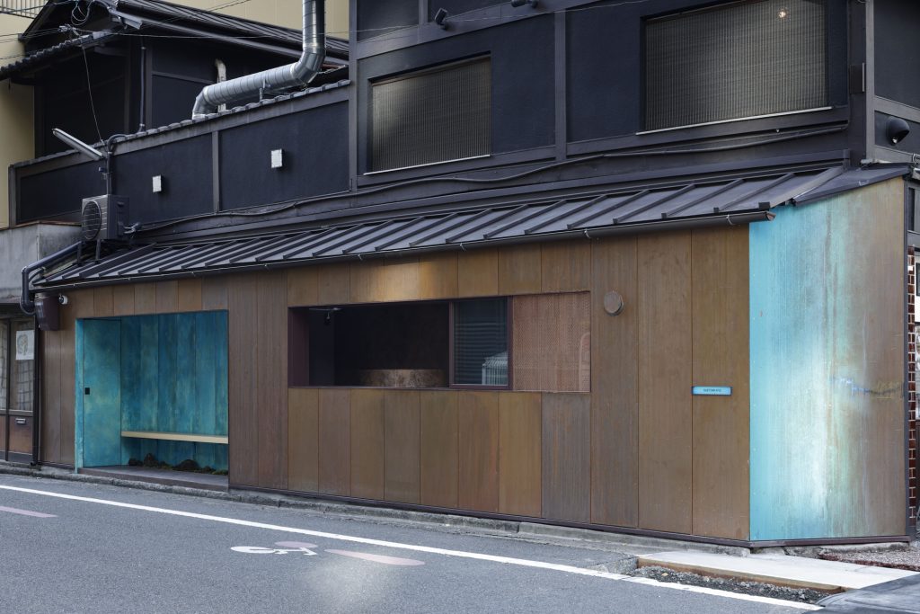
The floor plan is, by necessity, direct. Where the design becomes intricate is in the way the stand constructs its presence through vertical surfaces. The facade is treated as the primary architectural instrument, calibrated to communicate at street speed while remaining sensitive to the strict atmosphere of Kyoto’s cityscape. Rather than relying on overt branding, the project builds recognition through material time.
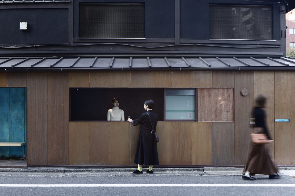
Copper becomes the narrative skin of the cafe stand. To achieve a controlled sense of age, the design team accelerated oxidation through a combination of soy sauce and chemical treatments, guiding the metal toward a weathered patina. The resulting tone nods to the brand’s distinctive “Suetomi blue” while speaking more broadly to Kyoto’s relationship with craft, surface, and seasons. Here, patina is not decoration; it is a designed timeline, compressing years into a finish that feels earned rather than applied.
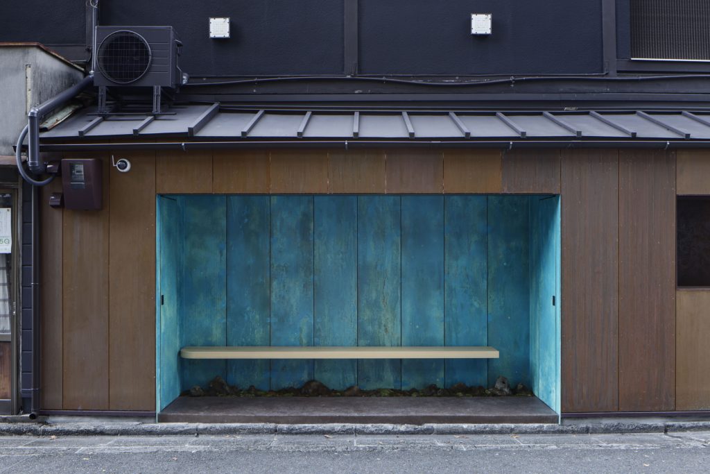
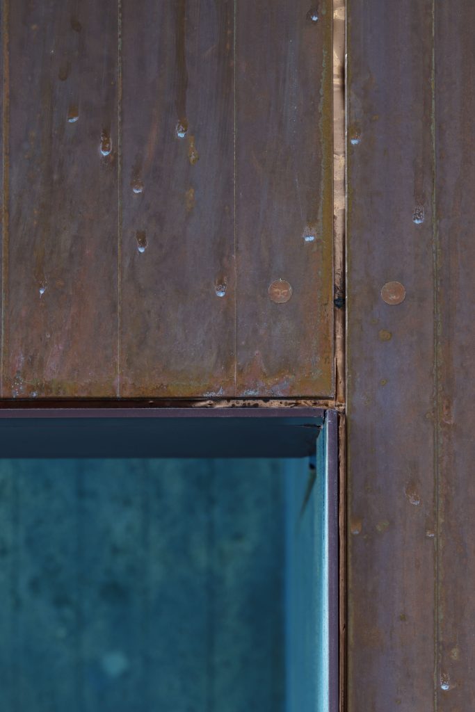
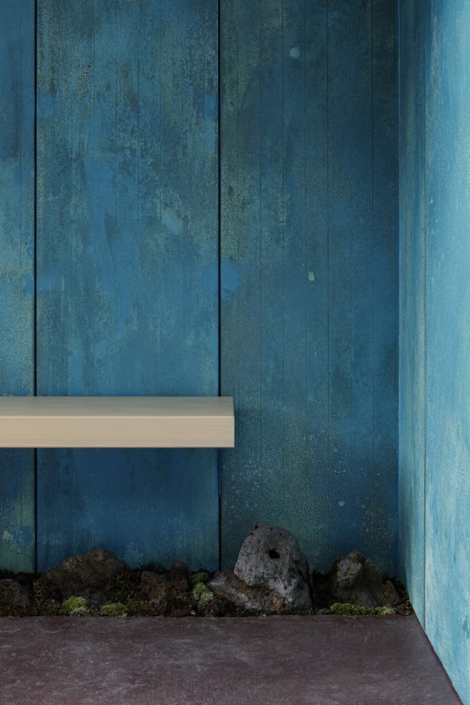

This careful ageing also works within the logic of local regulation, where the city’s visual discipline demands restraint. By leaning into natural oxidation as an approved process, the stand presents a nuanced palette that honours longevity without slipping into nostalgia. The facade becomes a bridge between contemporary street culture and the inherited rituals of wagashi, allowing the cafe to operate as a small urban ambassador for Suetomi’s heritage.
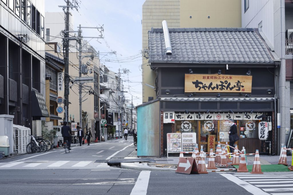
Positioned as a navigational cue, the stand quietly directs visitors toward Suetomi’s flagship store a short walk away. Its compact scale makes the gesture more precise: not a billboard in the conventional sense, but a visual landmark that helps stitch brand geography into the everyday movement of the city. In a district defined by circulation and transience, the cafe stand offers a point of orientation grounded in continuity.
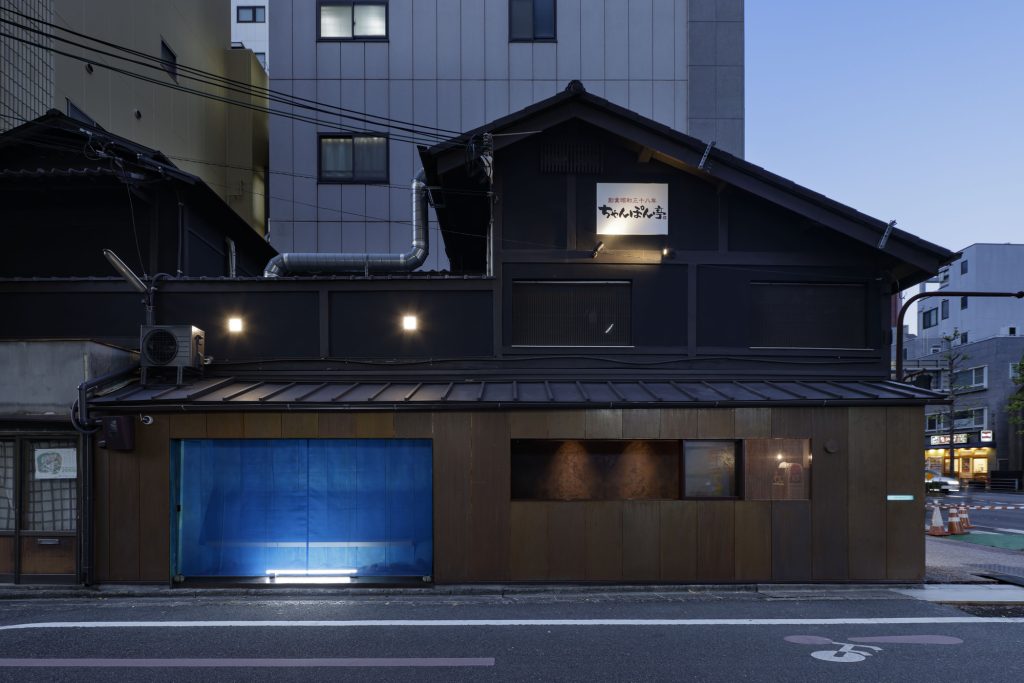
After dusk, the project shifts character. The facade’s presence intensifies as the stand becomes a luminous element in the streetscape, operating simultaneously as street lamp and urban signage. Light does not simply illuminate the counter; it expands the stand’s spatial reach, turning its shallow depth into a visual field that spills outward, catching peripheral vision and drawing passersby closer.
A roll screen, fabricated from the mesh commonly seen in construction scaffolding, closes the resting area when the cafe is not in use. The material choice carries an unexpected cultural echo, recalling bamboo blinds historically associated with Japanese nobility. Even in closure, the screen participates in the street, filtering light into a warm glow that maintains the stand’s relationship with the city and extends its invitation beyond operating hours.
Project Credit
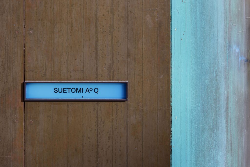
Project name: Suetomi AOQ Cafe Stand
Design: G architects studio, Ryohei Tanaka
Location: Kyoto, Japan
Photo: Daisuke Shima