Now Reading: Otl Aicher and the ethics of clarity in post war Germany
- 01
Otl Aicher and the ethics of clarity in post war Germany
In the aftermath of the Second World War, as West Germany attempted to reconstruct both its economy and its moral foundations, visual culture became a quiet but decisive arena of change. Design was no longer a matter of style or persuasion. It was a question of responsibility. In this climate, clarity emerged as a civic value, and few figures pursued it with the rigor and conviction of Otl Aicher.
During the early nineteen sixties, at the Ulm School of Design, Aicher and his collaborators undertook the redesign of Lufthansa’s visual identity. What appeared to be a corporate commission quickly revealed deeper implications. The national airline carried the weight of a country still struggling with its recent past. Any new image would need to communicate reliability, restraint, and a clear break from the visual language associated with authority and spectacle.
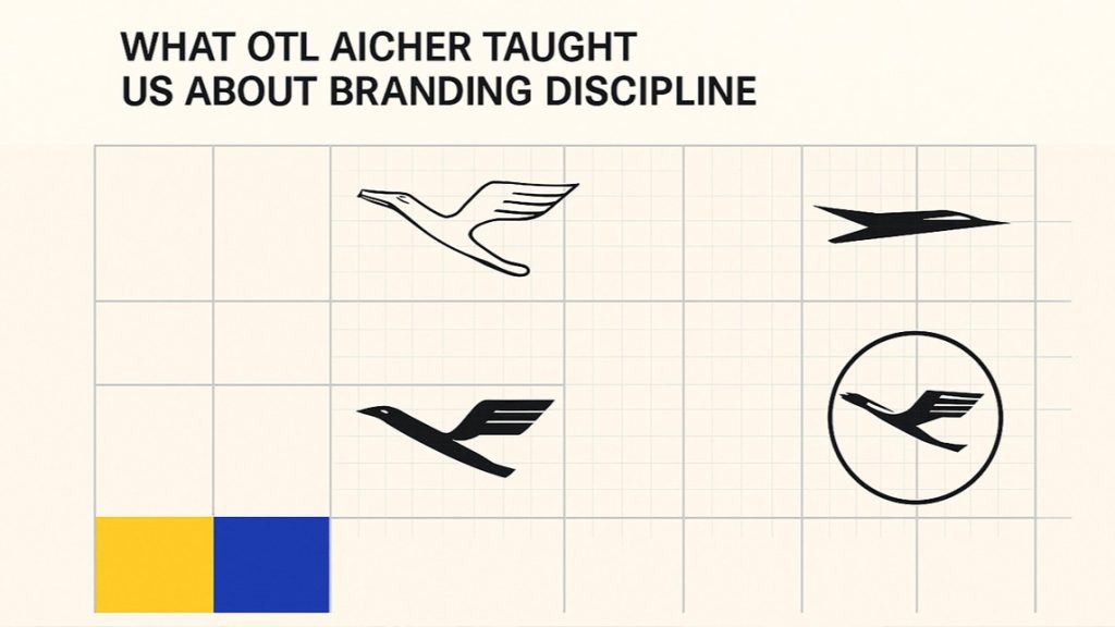
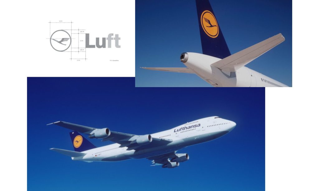
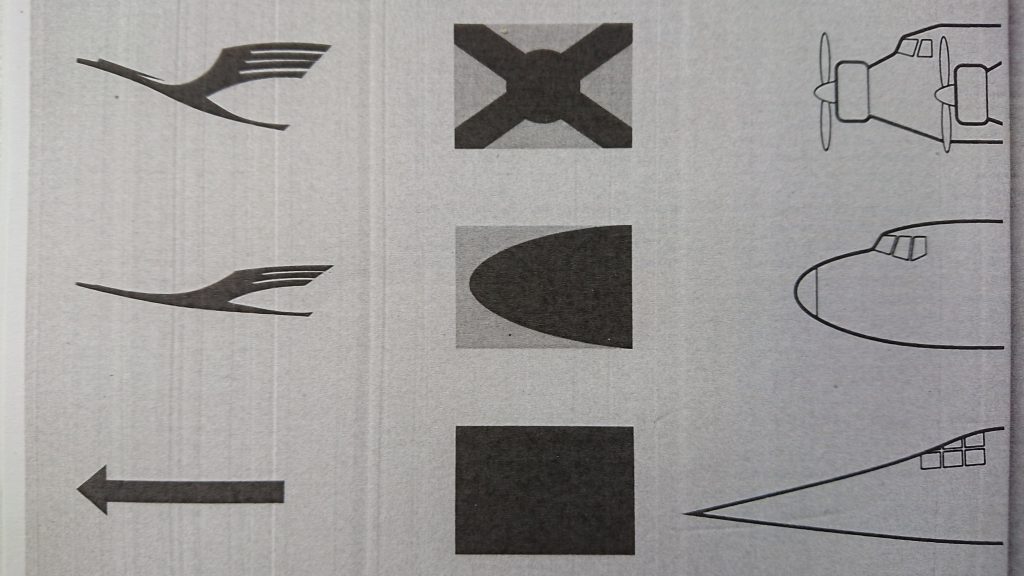
Aicher approached the task through reduction rather than reinvention. Otto Firle’s crane emblem from nineteen eighteen was retained, but its illustrative qualities were systematically stripped away. Archival material from Ulm documents a long process of refinement, moving from representational sketches toward increasingly abstract forms. Various directional motifs were tested before the final solution emerged: a stylised bird enclosed within a precise circle. The result conveyed motion without drama and stability without heaviness.
What ultimately defined the Lufthansa project was not the logo alone, but the discipline of the system surrounding it. Colour, typography, spacing, and application were governed by a strict grid. The blue and yellow palette was tested repeatedly to ensure consistency across aircraft exteriors, printed matter, interior elements, and service objects. Working with Hans Roericht and Fritz Querengässer, Aicher delegated individual components while maintaining control over the overall logic. Even cutlery and onboard materials were treated as integral parts of a coherent visual environment.
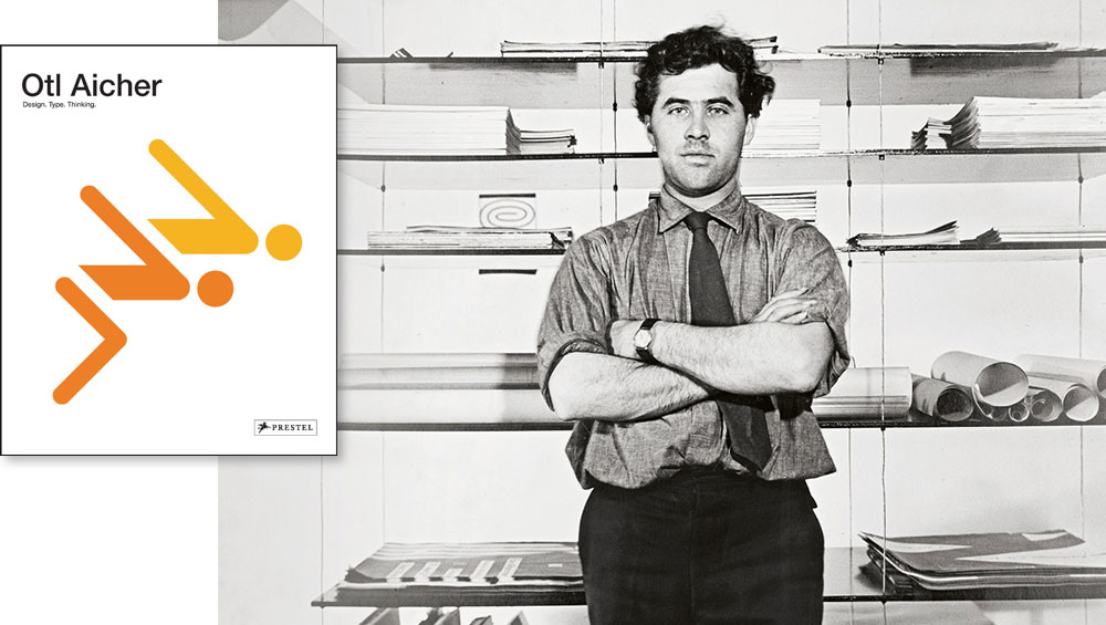
This emphasis on system over expression reflects Aicher’s broader understanding of design. Born in nineteen twenty two and largely self taught, his thinking was shaped by direct confrontation with authoritarianism and war. After deserting the Wehrmacht, and through his close association with the Scholl family, Aicher developed a deep suspicion of any form of design that relied on persuasion or emotional excess. For him, design was never neutral. It either clarified the world or contributed to its distortion.
That conviction became institutional through the founding of the Ulm School of Design in nineteen fifty three, alongside Inge Aicher Scholl and Max Bill. Ulm rejected both academic formalism and artistic self expression. Its ambition was to educate designers capable of engaging with industry, technology, and society through rational methods. Products and visual systems were to be intelligible, durable, and grounded in use rather than consumption.
Teaching at Ulm emphasised analysis, structure, and method. Students were trained to identify problems, construct systems, and evaluate outcomes. This approach was often perceived as severe, even dogmatic, yet it stemmed from a belief that clarity represented respect for the user. Responsibility, for Aicher, meant the continuous effort to establish order without imposing authority.
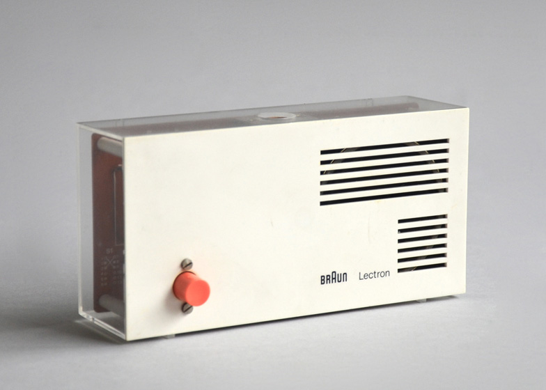
Beyond Ulm, Aicher’s influence extended into industry. His collaboration with Dieter Rams at Braun contributed to a disciplined visual language that mirrored the company’s product philosophy. Aicher provided typographic standards, grids, and a communicative restraint that reinforced clarity. Rams later recalled Aicher’s decisiveness and his refusal of decorative alternatives. Yet those who worked closely with him also noted a quieter dimension, marked by care rather than control.
This tension between rigor and humanity runs throughout Aicher’s work. While Ulm has often been criticised for dogmatism, Aicher resisted the reduction of his thinking to functionalism alone. He rejected environments that privileged efficiency over lived experience, pointing to post war housing projects that sacrificed daily life to standardisation. Beauty, in his view, was not ornament but an essential function, inseparable from use.
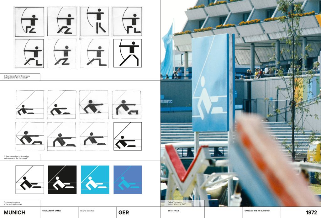
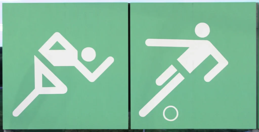
The visual identity of the Munich Olympic Games of nineteen seventy two offered a public demonstration of this belief. Tasked with presenting a new image of Germany, Aicher developed a comprehensive system of colour, typography, pictograms, and signage. Black and red were deliberately excluded. Instead, the palette drew from the Bavarian landscape, creating an atmosphere of openness and calm.
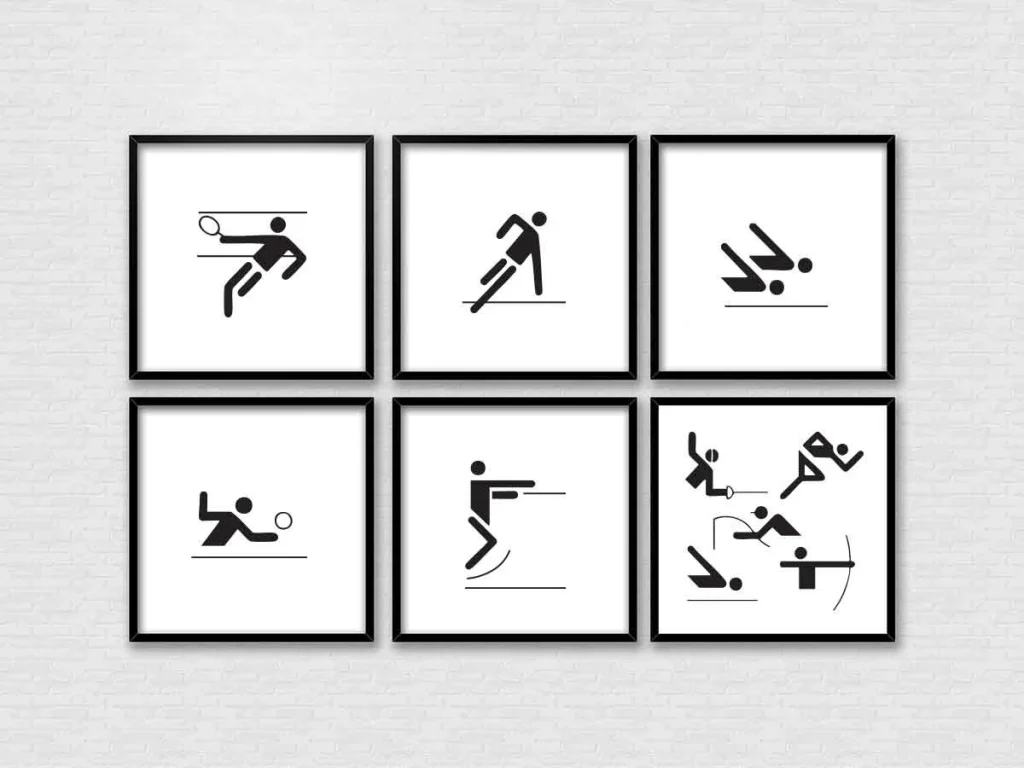
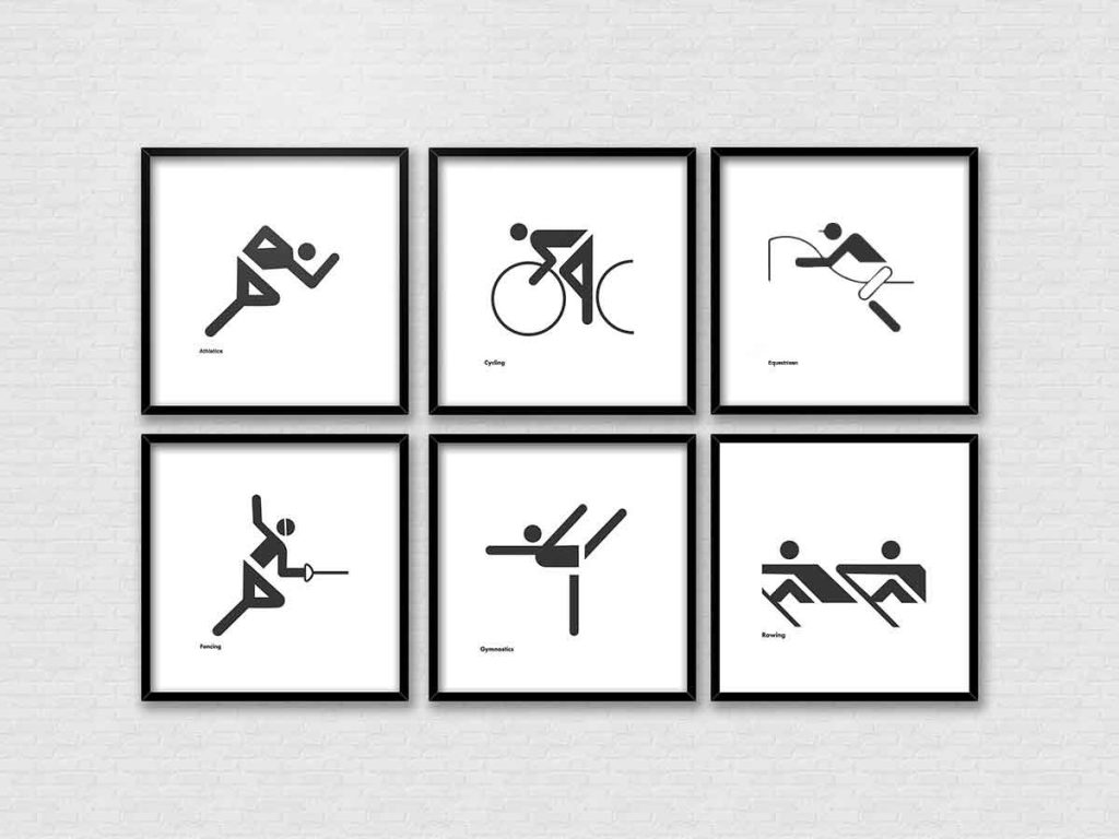
The pictograms designed for Munich established a new standard for international visual communication. Constructed on a consistent grid and reduced to essential gestures, they formed a language that could be understood across cultures. Aicher described them as elements within a rule based system, where meaning emerged through consistency rather than expression. Their influence remains visible in contemporary public wayfinding worldwide.
Typography occupied a similarly central role in Aicher’s thinking. The Rotis type family reflected his attempt to bridge historical categories within a single system. Controversial on its release, Rotis embodied his belief that clarity must remain responsive to context. Readability, not stylistic purity, guided its development.

Aicher’s methods remained resolutely analog. Sketches, film overlays, colour samples, and full scale mock ups formed the basis of his practice. For Munich, teams worked through countless iterations to maintain coherence across every application. With clients, Aicher demanded intellectual engagement, often insisting on reflection before form.
This insistence extended beyond graphics. In his work with Bulthaup, Aicher approached kitchen design through observation and use, studying professional environments to distill ergonomic principles. His writing framed domestic space as a site of intelligence rather than display. Similarly, his collaboration with FSB on door handles resulted in principles grounded in the physical act of grasping, where form followed the logic of the hand.
Even in explicitly political work, Aicher maintained an economy of means. His peace posters of the nineteen eighties avoided sentimentality, relying instead on direct visual statements. Across disciplines, the method remained consistent: reduction, structure, and ethical intent.

Aicher’s legacy does not reside solely in individual projects. It lies in a way of thinking about design as a civic act. From Lufthansa’s crane to Munich’s pictograms, from Ulm’s pedagogy to Rotis as a lived environment, he pursued coherence as a form of freedom. People, he believed, deserved environments that could be understood, navigated, and trusted.
In a contemporary landscape saturated with images and competing signals, Aicher’s insistence on clarity feels newly urgent. His work offers no nostalgia and no easy solutions. Instead, it proposes discipline as a cultural value and restraint as a form of care. The crane continues to fly, not as a symbol of progress, but as evidence that design grounded in ethics can endure.
Photo Cover
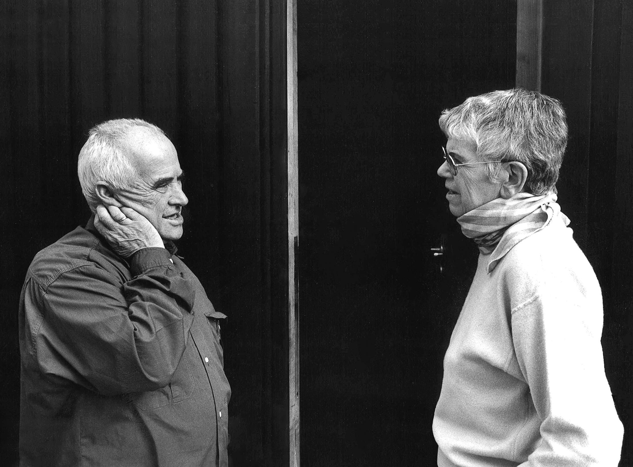
Otl Aicher (left) portrait in thoughtful pose, high-resolution black-and-white capturing his intense focus and ethical depth. Credit: © Florian Aicher / otlaicher.de